
-
World News

In El Obeid, Sudanese women face drones by day, rape by night, to reach water.
The gender equality agency UN Women issued a grave warning this week, highlighting a harrowing "dual terror" engulfing El Obeid,…
Read More » -
Technology

LimeWire Reimagines Its Legacy as a Pioneer in AI Content Creation and Web3 Monetization
In the rapidly evolving landscape of artificial intelligence and digital content, LimeWire, a name once synonymous with a contentious era…
Read More » -
Technology
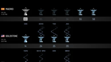
NASA’s Global Deep Space Network Grapples with Dual Outages as Madrid Complex Shuts Down Amid Raging Spanish Wildfires
The vital communications lifeline supporting humanity’s most distant space explorers, NASA’s Deep Space Network (DSN), is currently operating under significant…
Read More » -
Business & Finance

The Invisible Hand of Trust: Why Confidence, Not Just Numbers, Drives Business Success in the Modern Era
Listen to enough quarterly earnings calls and analyst briefings, and a peculiar pattern begins to emerge. Two companies, operating within…
Read More » -
Politics

The Unseen Toll: How Immigration Enforcement Ripples Through American Families and Communities
In Lake Worth Beach, Florida, the life of 21-year-old Eliza Perez has been irrevocably altered, thrusting her into the unexpected…
Read More » -
Politics

The Stealth Resurgence: A New Tar Sands Pipeline, Dubbed ‘Keystone Light,’ Raises Alarms as ‘Keystone XXL’
A formidable new tar sands pipeline project, proposed to ferry crude oil from the heart of Alberta, Canada, to Cushing,…
Read More » -
Science

NASA Astronaut Chris Williams and Crew Begin Journey Home from International Space Station
A multinational crew, including NASA astronaut Chris Williams, is set to undock from the International Space Station (ISS) early Sunday,…
Read More » -
Health & Wellness

Research4Life: A Quarter Century of Bridging the Global Knowledge Divide
The World Health Organization (WHO) today marks a significant milestone: the 25th anniversary of Research4Life, a groundbreaking public-private partnership that…
Read More » -
Health & Wellness

A Groundbreaking Discovery in Muscle Regeneration: Scientists Identify a Novel Compound to Combat Age-Related Muscle Deterioration
Skeletal muscle, the powerhouse of our mobility and strength, is unfortunately prone to a gradual decline as we age. This…
Read More » -
Health & Wellness
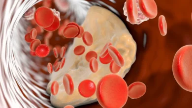
The ApoB Test: A Superior Metric for Heart Health Screening
The pursuit of optimal heart health necessitates a vigilant approach to monitoring key health indicators, with cholesterol levels standing as…
Read More »
