Google Analytics Reporting Analysis A Deep Dive
Google Analytics Reporting Analysis provides a comprehensive look at how to leverage data from Google Analytics to understand your website’s performance. This exploration delves into the core metrics, effective visualization techniques, and crucial KPIs to uncover actionable insights. We’ll cover everything from basic reports to advanced segmentation, troubleshooting, and best practices for creating compelling reports. Crucially, we’ll also touch on mobile and app analytics, expanding your understanding of user behavior across different platforms.
From understanding your audience and where they’re coming from to optimizing your marketing campaigns, Google Analytics offers a wealth of information. This analysis will help you interpret the data to make informed decisions and improve your website’s performance. We’ll provide practical examples, actionable strategies, and essential tips to ensure you’re making the most of your analytics data.
Introduction to Google Analytics Reporting: Google Analytics Reporting Analysis
Google Analytics is a powerful free tool provided by Google that allows businesses and website owners to understand how users interact with their online presence. It’s a cornerstone of digital marketing, offering insights into website traffic, user behavior, and conversion rates. This comprehensive understanding empowers informed decisions regarding website optimization, marketing strategies, and overall business growth.Google Analytics provides a wealth of data on website performance.
From tracking basic metrics like page views to complex analyses of user journeys, it offers a detailed picture of how visitors engage with a website. This detailed analysis helps identify strengths and weaknesses, allowing for targeted improvements to enhance user experience and achieve desired outcomes.
Key Metrics Tracked in Google Analytics Reports
Understanding the metrics tracked in Google Analytics reports is essential for effective analysis. Different metrics provide different insights into user behavior and website performance. These metrics can be grouped into several categories, such as user demographics, engagement metrics, and conversion rates.
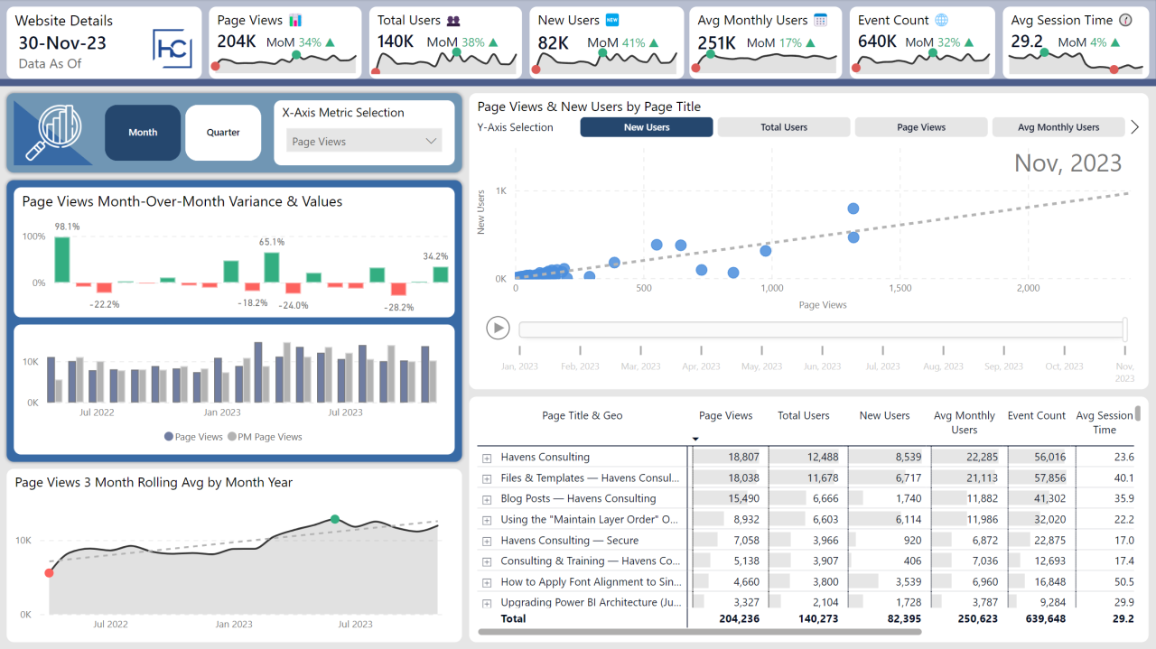
- Total Users: This metric represents the total number of unique visitors to your website during a specified period. It’s a fundamental metric for understanding website traffic volume.
- New Users: This metric tracks the number of first-time visitors to your website. Comparing new users to returning users can reveal how effective your strategies are at attracting new audiences.
- Average Session Duration: This metric indicates the average time spent by a user on your website during a single session. A longer average session duration suggests that users find your content engaging and valuable.
- Bounce Rate: The bounce rate represents the percentage of visitors who leave your website after viewing only one page. A high bounce rate could indicate that your website content or design is not engaging enough for users.
- Page Views: This metric counts the total number of pages viewed on your website. While useful in isolation, page views are most effective when analyzed alongside other metrics like session duration and bounce rate to get a more complete picture of user behavior.
- Conversion Rate: This is the percentage of website visitors who complete a desired action, such as making a purchase or filling out a form. A higher conversion rate indicates successful engagement and a strong user experience.
Common Google Analytics Reports
Google Analytics offers various reports to provide insights into different aspects of website performance. These reports are crucial for understanding user behavior and making data-driven decisions.
| Report | Description | Key Metrics |
|---|---|---|
| Audience Overview | Provides a high-level view of your website visitors, including demographics, interests, and behavior. | Total Users, New Users, Average Session Duration, Bounce Rate, Geographic Location, Demographics (age, gender, interests) |
| Acquisition Overview | Shows how users reach your website, including traffic sources, channels, and acquisition cost. | Traffic Sources (e.g., organic search, social media), Channels (e.g., paid search, email), Acquisition Cost, Referral Sites |
| Behavior Overview | Provides insights into user behavior on your website, including pages visited, time spent on each page, and events. | Page Views, Pages/Session, Average Session Duration, Bounce Rate, Event Tracking data |
| Conversions | Tracks the progress of users completing desired actions (e.g., purchases, sign-ups). | Conversion Rate, Conversion Value, Conversion Path, Conversion Source |
Data Visualization Techniques
Turning raw Google Analytics data into actionable insights often hinges on effective visualization. Presenting data visually makes patterns, trends, and anomalies instantly apparent, allowing analysts to quickly grasp the overall performance of a website or app. A well-crafted visualization can transform complex datasets into easily digestible information, ultimately boosting the efficiency of decision-making.Data visualization is crucial for extracting meaningful insights from the vast amounts of data generated by Google Analytics.
Different types of visualizations are best suited for different types of data. Choosing the right visualization method can significantly enhance understanding and communication of findings. This section explores effective data visualization techniques, offering examples and guidance for creating compelling dashboards.
Effective Presentation of Google Analytics Data
A critical aspect of data visualization is selecting the appropriate chart type to represent the data. Line charts excel at showcasing trends over time, while bar charts are ideal for comparing different categories. Scatter plots are effective for illustrating relationships between variables. Interactive dashboards, incorporating these visualizations, allow users to drill down into specific data points and explore the underlying details.
Interactive Dashboards
Interactive dashboards provide a dynamic way to explore Google Analytics data. Users can interact with the charts and graphs, filtering data by specific criteria, segmenting audiences, or examining various metrics in detail. Such dashboards provide a comprehensive view of key performance indicators (KPIs), enabling analysts to track progress, identify issues, and make data-driven decisions. A well-designed interactive dashboard can help answer crucial questions such as, “How are different marketing campaigns performing?”, or “Which user segments are most engaged with our content?”.
Choosing Appropriate Visualizations
The selection of visualization methods directly impacts the clarity and effectiveness of the analysis. For instance, a line chart is ideal for tracking website traffic growth over a period, while a bar chart is more suitable for comparing website traffic from different channels. Scatter plots can reveal relationships between bounce rate and time spent on site, for example.
Creating Engaging Visualizations
Creating engaging visualizations from Google Analytics data requires careful consideration of several factors. First, choose a chart type that effectively represents the data. Second, use clear and concise labels for axes and data points. Third, use colors and formatting that enhance readability and visual appeal. Finally, ensure the visualization is interactive and allows for data exploration.
For example, adding drill-down functionality allows users to explore specific data points in greater detail.
Comparison of Data Visualization Methods
| Method | Description | Use Case |
|---|---|---|
| Line Charts | Display trends over time, showing patterns and fluctuations. | Tracking website traffic growth, user engagement over time, and sales trends. |
| Bar Charts | Compare categories of data, highlighting differences between groups. | Comparing traffic from different channels, conversion rates across various marketing campaigns, and popular product comparisons. |
| Pie Charts | Show proportions of different categories, visualizing market share or distribution. | Representing traffic sources, device usage, or the distribution of user demographics. |
| Scatter Plots | Identify relationships between two variables, revealing correlations or trends. | Examining the relationship between time spent on site and conversion rates, or identifying user behavior patterns based on demographics. |
Key Performance Indicators (KPIs) and Analysis
Understanding your website’s performance is crucial for growth. Google Analytics provides valuable data, but raw numbers are meaningless without interpretation. This section delves into key performance indicators (KPIs) and how to analyze them to identify areas for improvement and optimize your marketing efforts.Effective analysis involves identifying the right metrics and understanding their implications. A deep dive into KPIs allows you to understand user behavior, track campaign effectiveness, and ultimately make data-driven decisions.
Crucial KPIs for Website Success
Website success hinges on various factors, and identifying the right KPIs allows you to measure progress effectively. Crucial KPIs provide insight into user engagement, conversion rates, and overall website health. These metrics help to determine if your website is achieving its goals and where improvements are needed.
Google Analytics reporting analysis is crucial for understanding website performance. A key aspect of this is looking at email marketing open rates, which can be significantly improved with the right strategies. Learning how to boost your open rate is vital for campaign success, and a great resource for this is how to increase open rate. Ultimately, using this data to refine your email campaigns will lead to more effective results in your Google Analytics reporting analysis.
- Bounce Rate: The percentage of visitors who leave your website after viewing only one page. A high bounce rate might indicate issues with content relevance, navigation, or site design. For instance, if a landing page is not relevant to the user’s search query, they may quickly leave.
- Conversion Rate: The percentage of visitors who complete a desired action, such as making a purchase or filling out a form. A low conversion rate suggests that your website is not effectively guiding users through the desired steps. If users struggle to find the call to action, the conversion rate will likely be low.
- Session Duration: The average time spent by a visitor on your website. A short session duration might indicate that the content is not engaging or that users are unable to find the information they need.
- Pages/Session: The average number of pages a visitor views during a session. A low number might suggest that the website lacks engaging content or that visitors are not able to find what they need.
- Traffic Sources: Understanding where your traffic is coming from (e.g., organic search, social media, paid advertising) allows you to identify successful marketing channels. High traffic from social media indicates strong engagement with your brand.
Interpreting Data to Identify Areas for Improvement
Analyzing data allows you to identify trends and patterns that highlight areas for improvement. The key is to compare your website’s performance to your goals and industry benchmarks. Understanding the factors influencing these metrics allows for targeted optimization.
- Compare against benchmarks: Industry benchmarks provide a crucial baseline for evaluation. Understanding average bounce rates, conversion rates, and session durations for your industry allows for objective comparison.
- Identify patterns: Look for correlations between specific actions and website metrics. For example, if your bounce rate is high on a particular page, examine its content and design to determine the reasons behind the high bounce rate.
- Focus on user experience: High bounce rates and low session durations often indicate issues with user experience. Analyzing user behavior through heatmaps and user recordings can reveal areas of friction in the user journey.
Tracking Marketing Campaign Performance
Tracking marketing campaign performance is essential for understanding their effectiveness. This involves comparing data from different campaigns to assess which strategies are driving the best results.
- Attribution modeling: Attribution modeling helps determine which marketing channels are most responsible for conversions. This analysis helps to refine your marketing strategy by allocating resources to the most successful channels.
- A/B testing: A/B testing involves creating variations of a page or element to see which version performs better. For example, testing different headlines or call-to-action buttons on a landing page allows for the identification of what drives conversions.
- Campaign-specific goals: Define specific goals for each campaign, such as increasing brand awareness or driving conversions. Measure progress towards these goals to assess campaign effectiveness.
Interpreting Bounce Rates and Other Key Metrics
Understanding different metrics is essential for analyzing website performance. A comprehensive analysis provides valuable insight for improvement.
- Bounce Rate Interpretation: High bounce rates might point to issues in content relevance, navigation, or page loading speed. Analyzing landing pages can help understand if the content matches user expectations.
- Other Key Metrics Interpretation: Other metrics, like session duration and pages per session, provide insights into user engagement. Low engagement often points to areas that need improvement in user experience or content quality.
KPI Table, Google analytics reporting analysis
| KPI | Description | Interpretation |
|---|---|---|
| Bounce Rate | Percentage of visitors who leave your website after viewing only one page. | High bounce rate may indicate issues with content or navigation. |
| Conversion Rate | Percentage of visitors who complete a desired action. | Low conversion rate may indicate a need for improvements in the user journey. |
| Session Duration | Average time spent by a visitor on your website. | Short session duration may indicate that the content is not engaging or that users are unable to find the information they need. |
| Pages/Session | Average number of pages a visitor views during a session. | Low number of pages per session may indicate that the website lacks engaging content or that visitors are not able to find what they need. |
Advanced Reporting and Segmentation
Diving deeper into your Google Analytics data unlocks powerful insights. Beyond basic reports, advanced techniques enable you to segment users, understand their behavior in greater detail, and tailor your strategies accordingly. This exploration delves into custom segments, dimensions, and metrics, empowering you to extract actionable intelligence from your data.
Segmenting Data for Deeper Insights
Segmentation is crucial for isolating specific user groups and understanding their unique behavior. By creating custom segments, you can identify patterns and trends within particular user groups. For instance, you could segment users based on their location, device type, or the specific pages they visited. This detailed breakdown enables a more focused analysis, allowing you to understand the nuances of each group and tailor your strategies effectively.
Custom Dimensions and Metrics
Custom dimensions and metrics are powerful tools that allow you to collect and analyze data that’s not natively available in Google Analytics. They enable you to collect data specific to your business, such as referral sources from specific campaigns or product variations. For example, you might add a custom dimension to track which marketing channel a user came from.
This extra data allows for a deeper understanding of the effectiveness of each channel. Custom metrics, like a unique conversion value or product page views, offer further customization.
Filtering and Analyzing Specific User Groups
Filtering your data allows you to focus on specific user segments for more detailed analysis. This could involve filtering by demographics, geographic location, or specific actions, like adding a product to a cart. For instance, you might filter for users who abandoned their shopping carts. Analyzing this specific user group can highlight pain points in the checkout process and enable you to implement improvements.
Creating Custom Reports
Creating custom reports is a key part of advanced analysis. It lets you combine different data points and visualize them in a way that best suits your needs. This allows you to track custom KPIs that are relevant to your business goals. For example, you might create a report that tracks the number of sign-ups from each marketing channel and the subsequent conversion rates.
Advanced Features in Google Analytics
Google Analytics boasts numerous advanced features beyond basic reporting:
- Advanced Segmentation: Allows for complex, multi-layered segmentation based on various criteria, creating highly targeted groups for deeper analysis.
- Custom Reports: Enables creation of reports tailored to specific business needs, offering a dynamic view of critical data points and KPIs.
- Funnel Analysis: Detailed analysis of user journeys through a website, allowing identification of drop-off points and optimization opportunities.
- Cohort Analysis: Tracks the behavior of specific groups of users over time, enabling the understanding of long-term trends and patterns.
- Predictive Analytics: While not fully predictive, Google Analytics allows for the identification of patterns and trends to inform estimations and future projections.
- Attribution Modeling: Allows for a more accurate understanding of the influence of different marketing channels on conversions.
Troubleshooting and Error Detection

Navigating Google Analytics data can sometimes feel like deciphering a complex code. Errors and discrepancies in reporting can lead to misinterpretations and flawed strategies. Understanding common pitfalls and effective troubleshooting methods is crucial for accurate analysis and informed decision-making. This section delves into strategies for identifying, resolving, and preventing issues in your Google Analytics data.Data discrepancies, if left unaddressed, can lead to incorrect conclusions and poor business decisions.
Identifying and resolving these discrepancies is critical to drawing reliable insights. This section will focus on common issues and how to diagnose and rectify them.
Common Google Analytics Reporting Issues
Incorrect tracking implementation is a significant source of data errors. Inaccurate tagging, improper code placement, or missing tracking parameters can result in incomplete or inaccurate data. Furthermore, issues with data collection, such as incorrect filter settings or problems with your data sources, can also distort your results. Regularly reviewing your tracking setup and adjusting it as needed is crucial to maintain reliable data.
Methods for Identifying Data Discrepancies
Comparison is key when identifying discrepancies. Compare your Google Analytics data with other relevant metrics, such as website traffic logs, sales figures, or marketing campaign reports. Significant deviations between these sources often point to issues within your Google Analytics setup. Look for inconsistencies in trends or patterns, unusual spikes or dips in key metrics, and any outliers that don’t align with expected behavior.
Employing data visualization tools like charts and graphs to pinpoint discrepancies visually is also helpful.
Troubleshooting Tracking Code Issues
Verifying the accuracy of your Google Analytics tracking code is paramount. Ensure the code is correctly implemented on all relevant pages of your website. Review the code snippet for any syntax errors, missing parameters, or incorrect placements. Testing the code with a known good setup or a test page can help isolate the problem. Using the Google Tag Assistant tool can identify potential issues with your tracking implementation.
This tool allows you to verify that your tracking code is firing correctly and identify any implementation errors.
Optimizing Data Collection and Accuracy
Implementing robust data collection practices is crucial for reliable reporting. Ensure your website’s code is optimized for performance and speed. Test different tracking configurations to find the most accurate representation of user behavior. Use the correct tracking parameters to accurately capture user actions. For example, accurately identifying unique visitors, bounce rates, and conversion rates is important.
Use appropriate filters to remove irrelevant data and ensure that you’re analyzing the correct data set. Regularly review and adjust your data collection methods based on changing website structure, traffic patterns, and marketing strategies.
Digging into Google Analytics reporting analysis is crucial for understanding website performance. Knowing how to optimize your data is key, but sometimes you need to focus on protecting your online presence. For example, if you’re looking to better secure your Facebook profile, checking out how to lock facebook profile can help. Ultimately, strong online security practices are essential, and this ties back to using Google Analytics effectively, allowing you to make data-driven decisions to boost your website’s success.
Ensuring Accurate and Reliable Data
Maintaining accurate and reliable data in Google Analytics is an ongoing process. Regularly review your data collection methods and identify any potential issues. Employ consistent data collection procedures to maintain data integrity. Utilize the various tools and resources provided by Google Analytics to troubleshoot and optimize your setup. A consistent approach to data collection and a proactive approach to identifying potential errors are vital to ensure the reliability of your analytics.
Reporting Best Practices
Crafting compelling Google Analytics reports goes beyond simply displaying data; it’s about translating raw numbers into actionable insights. Effective reports are clear, concise, and focused on driving decisions. This section Artikels best practices for creating reports that are not only informative but also empower stakeholders to understand and act upon the data.Effective reports serve as a bridge between the data collected and the strategic decisions made within an organization.
Digging into Google Analytics reporting analysis is crucial for understanding website performance. Knowing how users interact with your site is key, but sometimes the background technical stuff like optimizing audio for a smooth user experience is just as important. A good audio manager for Windows 11, like audio manager for windows 11 , can significantly impact user experience.
Ultimately, comprehensive reporting analysis from Google Analytics is essential to identify areas for improvement, no matter the technical nuances.
They should provide a clear picture of performance, identify areas for improvement, and ultimately support business goals.
Creating Effective Reports
Clear and concise visualizations are crucial for effective reporting. Visual representations of data, like charts and graphs, make complex information more accessible and understandable at a glance. Avoid cluttering reports with unnecessary details; focus on highlighting key trends and patterns.
Structuring Reports for Easy Understanding and Action
Report structure is paramount for usability. A well-organized report guides the reader through the key findings and allows for focused analysis. Start with a clear executive summary that highlights the key takeaways and the overall performance. Subsequent sections should be logically grouped, addressing specific aspects of the data, such as traffic sources, user behavior, and conversion rates.
- Executive Summary: Begin with a concise summary of the report’s key findings. This section should clearly state the overall performance and the main takeaways for stakeholders.
- Key Metrics and KPIs: Highlight the most important metrics relevant to the business objectives. Present these metrics with clear explanations and context.
- Data Visualization: Use charts and graphs to effectively communicate trends and patterns. Choose the right visualization for the data, ensuring clarity and avoiding misleading representations. Consider interactive elements for deeper exploration.
- Analysis and Insights: Provide clear explanations of the data and its implications. Connect the data to the business goals and highlight areas for improvement or optimization.
- Actionable Recommendations: End with specific recommendations based on the analysis. These recommendations should be actionable steps that stakeholders can implement to improve performance.
Presenting Actionable Insights to Stakeholders
Presenting actionable insights is critical. Avoid overwhelming stakeholders with technical jargon or excessive detail. Focus on the implications of the data and how it can directly impact their responsibilities. Frame recommendations as opportunities for improvement rather than criticisms. A good practice is to include a section with actionable recommendations.
- Focus on Outcomes: Translate data into business outcomes. Explain how the data affects key objectives and performance indicators.
- Use Simple Language: Avoid technical terms and jargon. Communicate insights in a clear and concise manner that resonates with a non-technical audience.
- Ask Questions: Encourage stakeholders to ask questions and engage in discussion. This promotes better understanding and buy-in.
- Highlight Key Takeaways: Use concise summaries and visually appealing charts to emphasize important findings.
- Present Options: If possible, present multiple options for addressing identified issues. This allows for a more collaborative decision-making process.
Checklist for Creating Compelling Reports
A checklist ensures consistent quality and completeness in your reports. It helps you systematically cover all the necessary elements.
- Clear Objectives: Define the purpose of the report and target audience.
- Data Collection: Ensure accurate and complete data collection from the relevant sources.
- Data Validation: Validate the collected data to avoid inaccuracies and errors.
- Visualizations: Use appropriate and clear visualizations for better understanding.
- Analysis and Insights: Analyze the data to identify trends and patterns, and provide meaningful insights.
- Actionable Recommendations: Formulate clear and actionable recommendations based on the analysis.
- Review and Feedback: Obtain feedback from stakeholders to ensure the report is effective and meets their needs.
Mobile and App Analytics
Mobile apps and websites are intertwined in today’s digital landscape. Understanding how users interact with both is crucial for any business looking to optimize their offerings. This section delves into the specifics of mobile and app analytics, highlighting the unique challenges and opportunities presented by this diverse platform.Mobile analytics requires a different lens compared to traditional web analytics.
App-specific metrics, such as in-app purchases and user retention, provide crucial insights into user engagement that web analytics might miss. The aim is to leverage this data to improve the user experience and drive conversions across both platforms.
Specific Considerations for Mobile App and Website Analysis
Mobile devices, with their diverse operating systems and varying screen sizes, present unique challenges in user experience design. Optimizing for these differences is key to a positive user experience. Different devices and operating systems can significantly impact how users interact with the interface. The mobile experience must be responsive and adaptable.
Comparing Mobile and Web Analytics Reporting
While both mobile and web analytics track user behavior, the metrics and tools used differ significantly. Web analytics focuses on page views, bounce rates, and time on site, while mobile analytics emphasizes app usage, user retention, and in-app events.
- Web analytics often focuses on user journeys across multiple pages. Mobile analytics focuses on the user’s engagement within a single application.
- Web analytics relies on cookies and server-side data. Mobile analytics may incorporate device-specific data and other sources.
- Web analytics tools can be more readily adapted to track the complete user journey. Mobile analytics tools, on the other hand, are more focused on the specific actions and behaviors within the app.
Measuring App Engagement and User Behavior
Key performance indicators (KPIs) for app engagement and user behavior differ substantially from those of web analytics. Effective measurement requires careful selection of relevant metrics. Monitoring these KPIs provides insight into user satisfaction and potential areas for improvement.
- App Downloads and Installs: Tracks the initial adoption rate of the app. High download numbers can indicate significant interest, but sustained engagement is crucial.
- Daily/Weekly Active Users (DAU/WAU): Measures the number of users actively engaging with the app over a period. Sustained high DAU/WAU numbers signal a healthy user base.
- Session Duration: Indicates how long users spend within the app. A longer session duration often suggests higher user satisfaction and engagement.
- Feature Usage: Tracks the frequency and type of features users engage with. This helps understand user preferences and potential areas for improvement.
- Retention Rate: Measures the percentage of users returning to the app over time. High retention rates suggest a strong user base.
Optimizing User Experience Across Different Platforms
Creating a consistent and positive user experience across mobile and web is vital for brand consistency and user satisfaction. A seamless experience fosters loyalty.
- Responsiveness: Mobile-first design principles ensure the website adapts to various screen sizes and resolutions. Ensuring responsiveness across different mobile devices is essential for a consistent user experience.
- Performance: Fast loading times and efficient application performance are critical for user engagement. Optimizing for speed and performance improves the user experience.
- Navigation: Intuitive and user-friendly navigation on both platforms is critical for seamless user experience. Simplifying navigation improves user satisfaction.
Creating Reports Specific to Mobile Applications
Custom reports tailored to mobile app usage provide deeper insights into user behavior. This tailored approach yields actionable data for strategic decision-making.
- In-App Purchase Analysis: Track the number of in-app purchases, revenue generated, and the types of items purchased. This data helps in optimizing pricing strategies.
- User Flow Analysis: Visualize the sequence of user actions within the app, pinpointing areas of friction or drop-off points. This allows for identifying and addressing user experience bottlenecks.
- Conversion Rate Tracking: Monitor the percentage of users completing desired actions within the app. This data helps to understand the effectiveness of different app features.
End of Discussion
In conclusion, mastering Google Analytics reporting analysis empowers you to transform raw data into actionable insights. By understanding key metrics, employing effective visualization techniques, and implementing best practices, you can optimize your website and marketing campaigns. The insights gained from this analysis allow you to make informed decisions, improve user experience, and ultimately drive business growth. Remember, consistent analysis and adaptation are key to maximizing your data’s potential.