Responsive web design mobile first is crucial for a seamless user experience. It prioritizes the mobile version of a website, adapting to various screen sizes. This approach ensures optimal viewing and functionality across all devices, from smartphones to desktops. This guide delves into the core principles, development workflows, and best practices of responsive mobile-first design, including content strategy, accessibility, performance optimization, and future trends.
This comprehensive exploration will guide you through the entire process, from initial design considerations to ongoing maintenance. We’ll examine essential technologies like HTML5, CSS3, and JavaScript, and analyze effective responsive frameworks to create visually appealing and functional websites. Understanding the key principles of mobile-first design will be instrumental in developing user-centric web experiences.
Responsive web design is a crucial aspect of modern web development, enabling websites to adapt seamlessly to various screen sizes and devices. This approach ensures a consistent and optimal user experience across desktops, tablets, and smartphones. It’s no longer sufficient to have separate websites for different devices; a single, adaptable design is paramount.The core principle of responsive design lies in its ability to adjust the layout and presentation of content based on the characteristics of the viewing device.
This involves using flexible grids, fluid images, and media queries to dynamically modify the website’s structure, making it accessible and engaging on any screen.
Core Principles of Responsive Web Design
Responsive design is built upon several fundamental principles. These principles work together to ensure a positive user experience across a range of devices. Flexible layouts are key, using relative units (like percentages) instead of fixed pixel values. This allows the layout to scale and adjust as the screen size changes. Images also need to adapt, employing techniques like responsive images to maintain quality and prevent excessive loading times.
Media queries, which are CSS rules triggered by specific screen conditions, are the engine of responsive design. They define how the website should appear on different devices.
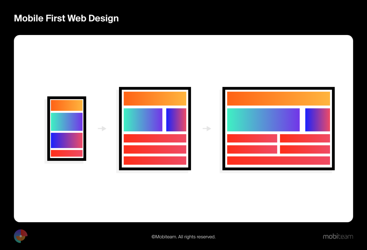
Mobile-First Development
Mobile-first development is a strategy within responsive design where the initial design is optimized for mobile devices. This prioritizes the user experience on the smallest screen, ensuring a functional and user-friendly interface. This approach helps in creating a more efficient and streamlined user experience from the outset. This methodology often leads to cleaner and more intuitive designs. It also encourages the consideration of user needs and behavior from the perspective of the smallest screen size.
Advantages of Mobile-First
Adopting a mobile-first approach offers numerous advantages. First, it encourages a more user-centric design process, focusing on the essential elements of the site. This often results in simpler, more focused interfaces. Second, it reduces development time and costs. By building a foundation on a simpler design, the process of adapting to other screen sizes becomes more straightforward.
Third, it often leads to a more efficient use of resources. By minimizing the number of elements and the complexity of the design, the website uses fewer resources and loads faster. Finally, it usually results in better performance, as mobile-friendly websites are favored by search engines.
Benefits for Users
Responsive design provides a multitude of benefits for users. A key benefit is the seamless experience across various devices. Users can access and interact with the website without needing to adjust their behavior or learn new navigation methods. This consistent experience fosters user engagement and satisfaction. Further, responsive designs often improve website performance and load times, leading to a faster and more efficient user experience.
This is because the design is tailored to the capabilities of the device, optimizing loading times and reducing unnecessary data usage.
Screen Size Adjustments
A responsive website adapts to different screen sizes. The following table illustrates the adjustments made for different screen widths:
Embracing a mobile-first approach to web design prioritizes the mobile experience, ensuring optimal viewing and usability on smaller screens before scaling up to larger devices. This strategy fosters a more user-friendly experience, as it emphasizes a core principle of responsive design—making content easily digestible on the most prevalent platform.This methodology also allows developers to streamline the design process. By initially focusing on the mobile interface, designers can ensure a clean, uncluttered, and efficient experience.
This focus translates into a more polished and intuitive design for all screen sizes.
Steps in the Mobile-First Process
The mobile-first approach typically follows a structured sequence. First, designers and developers meticulously plan the layout and functionality of the website on a mobile device. This foundational work is crucial, setting the stage for the desktop and tablet versions. Subsequently, the design is refined and adapted for larger screens.
Planning and Wireframing: The initial phase involves creating wireframes and prototypes specifically for mobile devices. This ensures that the core functionality and navigation are well-defined and user-friendly on the smallest screen size.
Mobile Development: Building the website’s structure and front-end elements for mobile devices. This includes implementing the mobile-first design in the chosen framework, ensuring responsiveness and a fluid layout.
Desktop Adaptation: The design is then adapted to fit larger screens. This stage often involves expanding content areas, adding more features, and adjusting the layout to optimize the user experience for desktops and tablets. This process is not a mere scaling of the mobile layout; it involves careful consideration of the unique needs of the different screen sizes.
Testing and Refinement: Thorough testing across various devices and screen sizes is critical. This helps to identify and address any usability issues or layout problems before launching the website. Continuous testing throughout the process ensures a consistent user experience.
Importance of Flexible Grid Systems
A flexible grid system is an essential component of responsive web design. These systems provide a structured framework for organizing content, ensuring consistent layout across different screen sizes. This structure enhances the visual appeal and user experience.
Using a grid system allows for easy adaptation to varying screen sizes, as elements are positioned within a defined structure that adapts to the available space.
Media Queries for Adaptation
Media queries are used to adjust the styling of elements based on the characteristics of the device or browser. This allows for different styles to be applied based on screen size, orientation, and other factors, tailoring the experience to the device.
For example, a media query could adjust the font size on a mobile device to improve readability, while a different media query could change the layout of the website for a tablet.
Responsive Design Frameworks
Various frameworks simplify the implementation of responsive web design. These frameworks provide pre-built components and tools that streamline the development process. Some popular choices include Bootstrap, Foundation, and Material Design.
These frameworks often include pre-designed components, grid systems, and media query configurations that significantly reduce development time.
Comparison of Grid Systems, Responsive web design mobile first
Grid System
Pros
Cons
Suitable for
Bootstrap
Extensive documentation, large community support, well-maintained, widely used, and easy to learn. It offers pre-built components for common UI elements.
Can sometimes feel verbose for simpler layouts, might not be the best choice for highly custom designs.
General-purpose websites, web applications, and projects needing a broad range of UI elements.
Foundation
Modular and flexible, offering more customization options than Bootstrap. The grid system is well-defined and offers a good balance between structure and flexibility.
Learning curve might be steeper than Bootstrap, documentation can be more challenging in some areas.
Websites and applications requiring a higher degree of customization and a more modular approach to design.
Tailwind CSS
Utility-first approach provides highly granular control over styling, allows for extreme flexibility and customization, and offers a wide range of pre-built components.
Can be overwhelming for beginners, requires careful planning, and extensive knowledge of CSS.
Projects demanding maximum customization, complex layouts, and a focus on performance.
Custom Grid System
Complete control over the styling and layout.
Requires significant development effort, maintenance and debugging can be more complex.
Projects needing highly specific or unique layouts.
Key Technologies and Tools
Responsive web design hinges on a strong foundation of core technologies. Mastering these tools allows developers to craft websites that seamlessly adapt to various screen sizes and devices, delivering an optimal user experience across the spectrum. From the fundamental building blocks to sophisticated frameworks, understanding these components is crucial for building successful responsive websites.HTML5, CSS3, and JavaScript form the cornerstone of modern responsive design.
HTML5 provides semantic structure, enabling clear and meaningful content organization. CSS3 empowers developers with advanced styling options, including media queries, which are essential for adapting styles based on screen size and device characteristics. JavaScript enhances interactivity, adding dynamic elements and functionality that improve the user experience on various devices. Together, these technologies allow for complex layouts and dynamic behaviors that remain consistent across different screen sizes.
Responsive web design, focusing on mobile first, is crucial these days. With the increasing number of users accessing websites on their phones, ensuring a seamless experience is paramount. This is especially important given the impending thunderstorms with pea sized hail to hit northern California Wednesday, as reported here. After all, a site that looks great on a phone is much more useful than one that’s a frustrating mess.
Mobile-first design, therefore, isn’t just a trend—it’s a necessity for any modern website.
This website uses cookies so that we can provide you with the best user experience possible. Cookie information is stored in your browser and performs functions such as recognising you when you return to our website and helping our team to understand which sections of the website you find most interesting and useful.
Strictly Necessary Cookies
Strictly Necessary Cookie should be enabled at all times so that we can save your preferences for cookie settings.
If you disable this cookie, we will not be able to save your preferences. This means that every time you visit this website you will need to enable or disable cookies again.


