The Evolution of Automotive Branding: Why Manufacturers Are Replacing Emblems with Typography

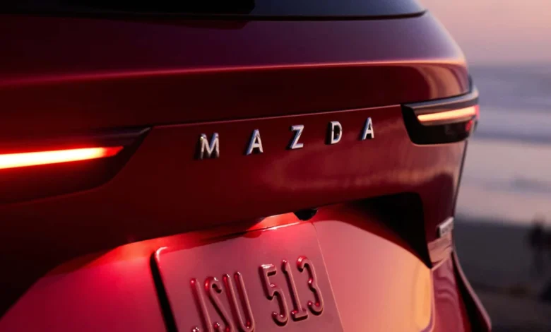
For decades, the automotive industry relied on a simple, singular visual shorthand: a chrome badge. Whether it was the three-pointed star of Mercedes-Benz, the blue oval of Ford, or the prancing horse of Ferrari, a small, metallic emblem served as the definitive anchor for brand identity. These icons were designed to be instantly recognizable from a distance, acting as the primary point of contact between a manufacturer and the public. However, in the current landscape of automotive design, this paradigm is shifting. A growing number of automakers are moving away from traditional symbols, opting instead to spell out their full names in bold, integrated lettering across the front and rear fascia of their vehicles.
This transition is far from a mere aesthetic preference; it represents a fundamental change in how manufacturers conceive of visual communication in an increasingly crowded global market. By transforming brand names into core architectural elements of the car’s design, automakers are effectively reinventing their visual language to remain relevant in a digital-first, high-competition environment.
A Brief Chronology of Automotive Identification
To understand the current trend, one must look at the history of vehicle identification. In the early 20th century, branding was often literal. Manufacturers placed script-style nameplates on the radiator shells or trunk lids of vehicles, simply because the concept of a "brand logo" had not yet been fully commodified or standardized. As the industry matured in the mid-20th century, the shift moved toward stylized emblems. These badges were cost-effective, durable, and easily mass-produced, allowing manufacturers to keep the body panels of their cars cleaner and more aerodynamic.
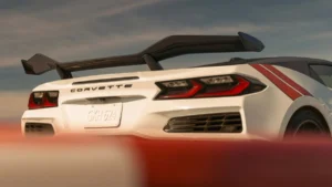
However, the late 20th century saw a resurgence of the full-name trend, though it was often relegated to luxury or performance marques. Porsche, for instance, has long maintained the practice of placing its name across the rear deck of the 911, a decision rooted as much in tradition as in design balance. Volvo, too, has frequently utilized its name in broad, clear typography, particularly on its SUVs and wagons, to reinforce a sense of Scandinavian minimalism and structural integrity.
In the 2010s and 2020s, this practice moved from the exception to the rule. The catalyst was largely the rise of electric vehicle (EV) design. As manufacturers moved toward "Modern Solid" design languages—characterized by flat surfaces, lack of traditional grilles, and streamlined aerodynamics—the traditional raised emblem often looked jarring or out of place. Replacing a heavy, three-dimensional badge with sleek, flush-mounted, or integrated lettering allowed designers to maintain the flow of the vehicle’s bodywork while still providing clear brand recognition.
The Design Philosophy: Typography as Architecture
The current trend goes beyond merely swapping a logo for a word. Modern design teams are treating typography as an essential component of the vehicle’s "light signature" and overall geometry. When an automaker like Peugeot integrates its name into an illuminated rear light bar, the lettering ceases to be an external attachment and becomes a structural feature.
This design strategy offers several functional advantages:
- Visual Balance: In modern vehicle design, the rear of the car is often dominated by large, horizontal taillight clusters. A small, central badge can look "lost" in the negative space between these lights. Stretching the brand name across the width of the trunk lid creates a sense of horizontal balance, which reinforces the perception of a wider, more stable, and more premium vehicle.
- Surface Integration: As vehicles move toward minimalist aesthetics, designers are looking for ways to avoid "visual clutter." Traditional badges often require holes to be drilled into the sheet metal or complex mounting hardware. Modern lettering, often applied via high-strength adhesive or integrated into trim pieces, allows for a smoother, cleaner finish that aligns with the high-tech, digital-first aesthetic of the EV era.
- Cross-Market Standardization: In an era where a single vehicle model is often sold in dozens of countries, linguistic and cultural recognition is paramount. While a badge may be misunderstood or unfamiliar in emerging markets, a clear, standardized typeface spelling out the company name ensures that the brand identity is communicated unequivocally to a global audience.
Market Data and Competitive Pressures
The proliferation of these naming conventions is also a direct response to the explosion of the global automotive market. According to recent industry data, the number of active automotive brands has increased significantly over the last decade, driven by the emergence of new manufacturers in China, India, and Vietnam. With dozens of new players entering the international stage, the competition for consumer attention is higher than ever.
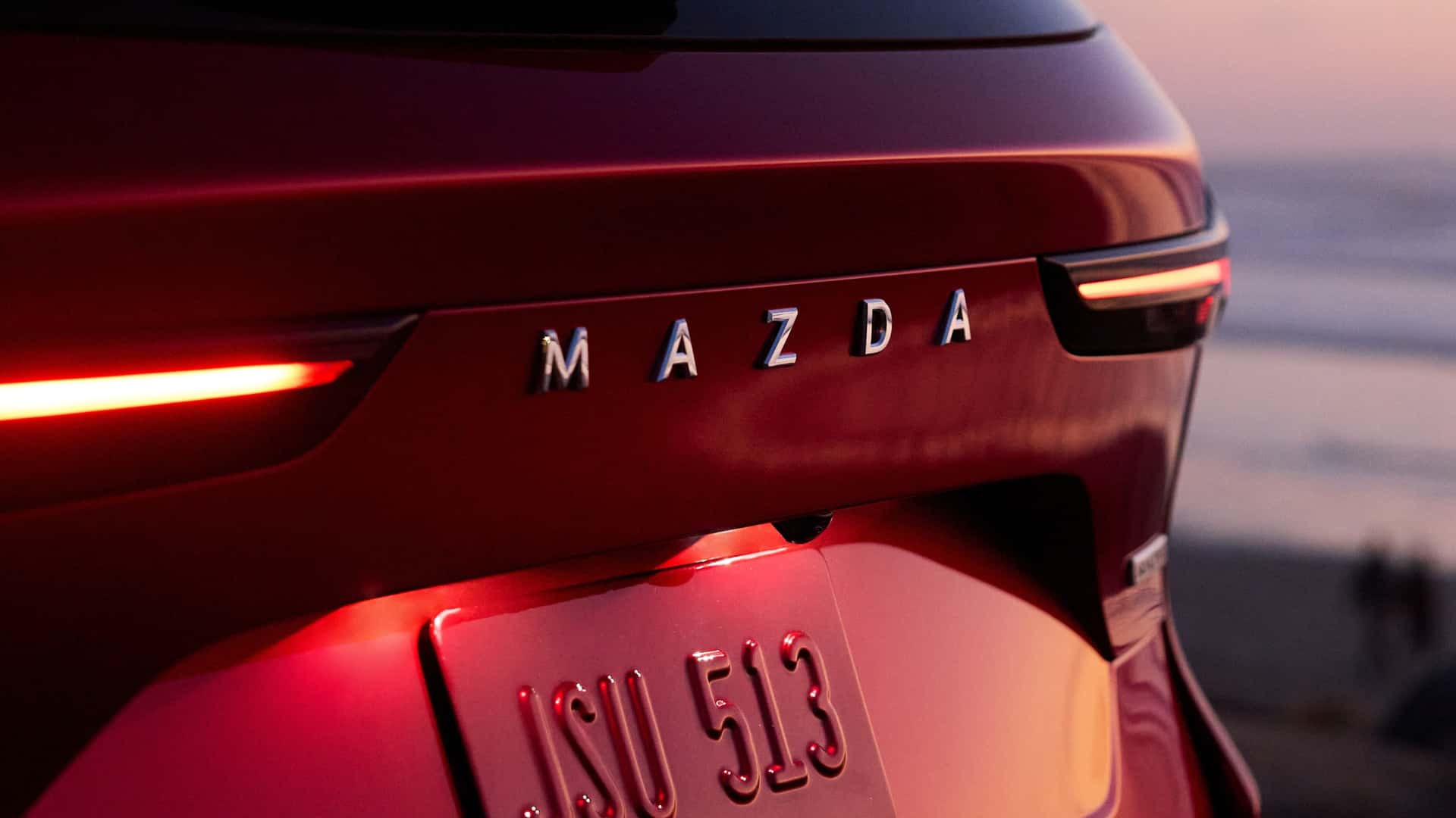
Brand consultants suggest that as the visual noise of the automotive market increases, the "brand name" becomes the most valuable asset. A logo can be abstract, but a name provides immediate context. For legacy automakers, the shift to prominent lettering is also a way to signal a "clean slate." By updating the font, spacing, and application of their name, manufacturers can subtly signal to consumers that the company is undergoing a modernization phase, particularly as they transition their lineups from internal combustion engines to battery-electric powertrains.
Official Perspectives and Industry Reactions
While few manufacturers release official press statements regarding the "de-badging" of their products, the design manifestos of several major brands shed light on the shift. Skoda’s "Modern Solid" design language, for instance, explicitly mentions the use of typography as a way to "humanize" the vehicle and create a stronger connection with the driver. By using the brand name as a focal point, the vehicle feels less like a product of a faceless corporation and more like a curated piece of design.
Designers at firms like Lancia and DS Automobiles have also noted that the typeface choice is now subjected to the same rigorous testing as aerodynamic drag coefficients or interior ergonomics. The kerning (the space between letters), the stroke weight, and the material finish of the letters are meticulously calculated to ensure they are legible from a distance of 50 meters, yet refined enough to look premium under the scrutiny of a showroom environment.
The Broader Implications for Automotive Identity
Does the rise of spelled-out names mean the end of the traditional emblem? Industry analysts suggest it is unlikely. The "Badge" is often the strongest historical asset a company possesses. Brands like Mercedes-Benz, BMW, and Toyota have spent a century building equity in their logos; abandoning them would be a marketing catastrophe.
Instead, we are seeing a "dual-branding" approach. Many manufacturers are keeping their traditional emblems on the hood or trunk while using large, elegant lettering to denote the model name or the brand name across the rear. This allows for a tiered communication strategy: the badge signals the heritage, while the typography signals the contemporary nature of the product.
Furthermore, the integration of light into these letters—a feature pioneered by high-end luxury brands and now trickling down to mass-market manufacturers—is changing the vehicle’s "night face." In the past, you could recognize a car at night by its headlights and taillights. Today, with the rise of illuminated lettering, the brand name itself is becoming part of the vehicle’s light signature. This creates a powerful, high-visibility branding moment that is impossible to miss.
Conclusion
The move toward spelling out brand names on the body of a vehicle is a defining trend of the 2020s. It reflects a shift in automotive design toward minimalism, technological integration, and globalized communication. As surfaces become cleaner and vehicles rely more on digital identity, the humble word—styled, spaced, and sometimes illuminated—has proven to be a more effective tool for building brand recognition than the traditional chrome badge.
As we look toward the future of autonomous and electric mobility, the car is increasingly becoming a mobile digital device. In this context, the clear, legible, and prominent display of a brand’s name is not just a stylistic choice; it is a necessity for a competitive market. Whether this trend persists or eventually gives way to a new form of visual shorthand remains to be seen, but for now, the message is clear: the name of the game is, quite literally, the name itself.